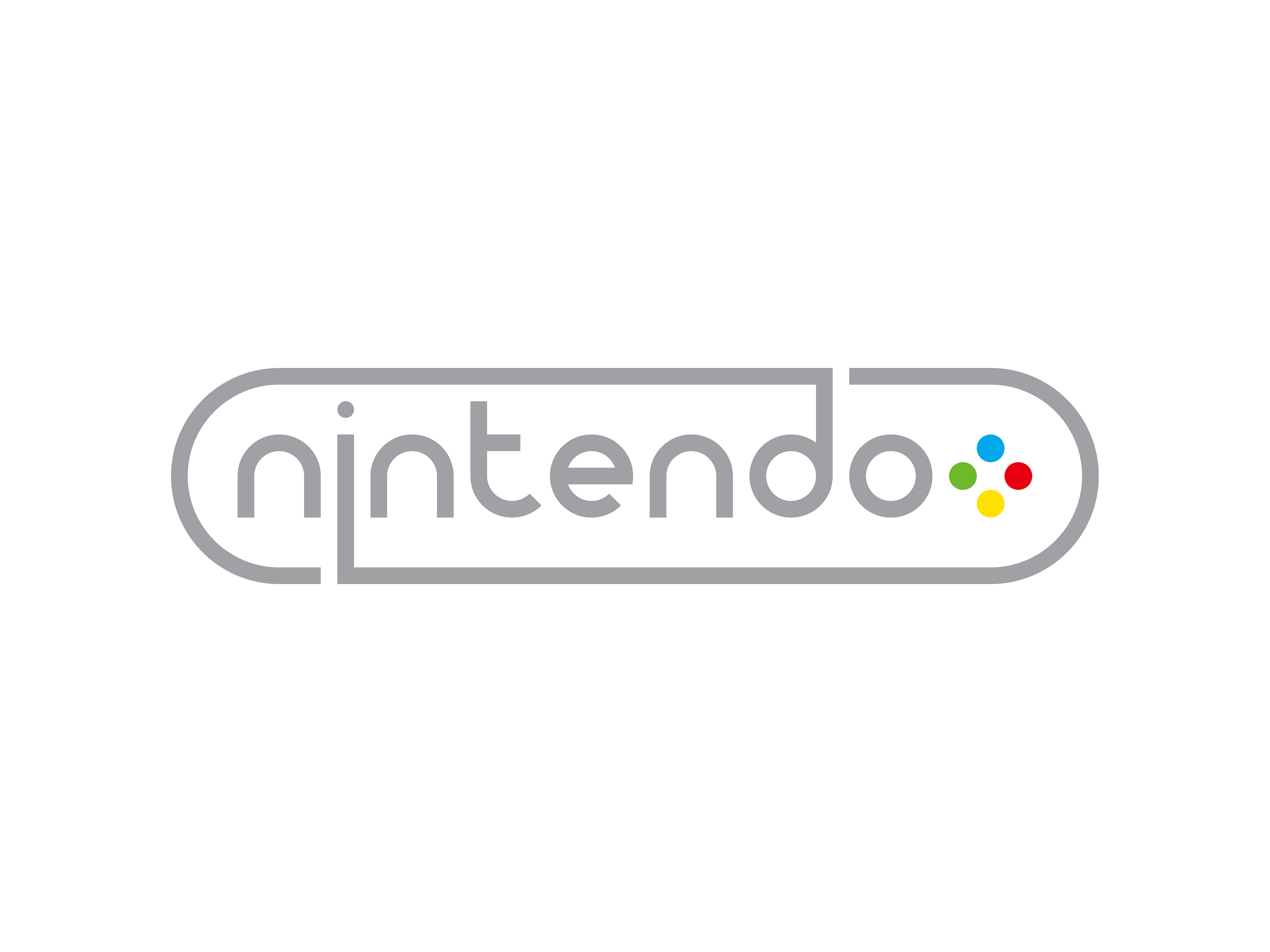
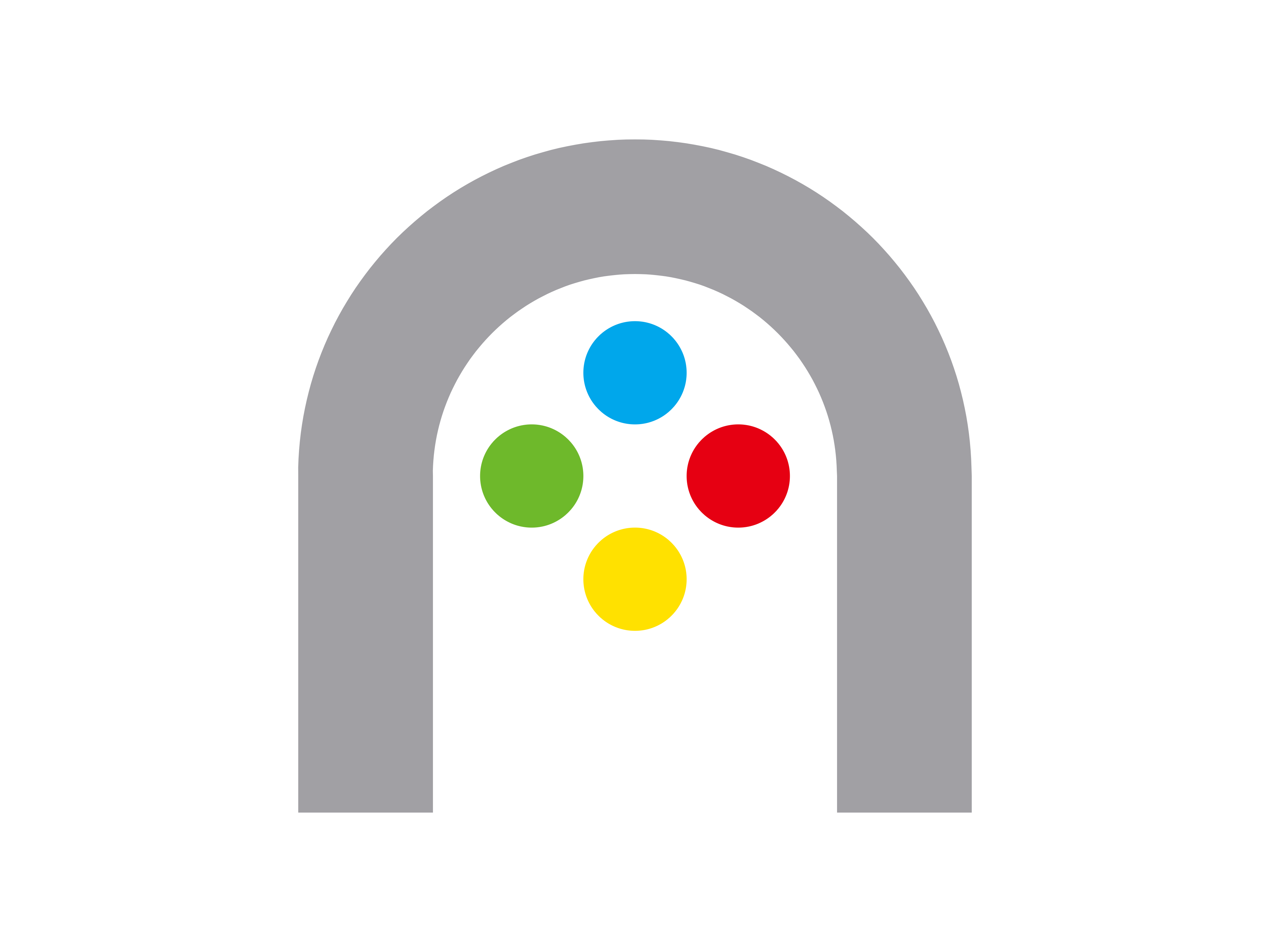
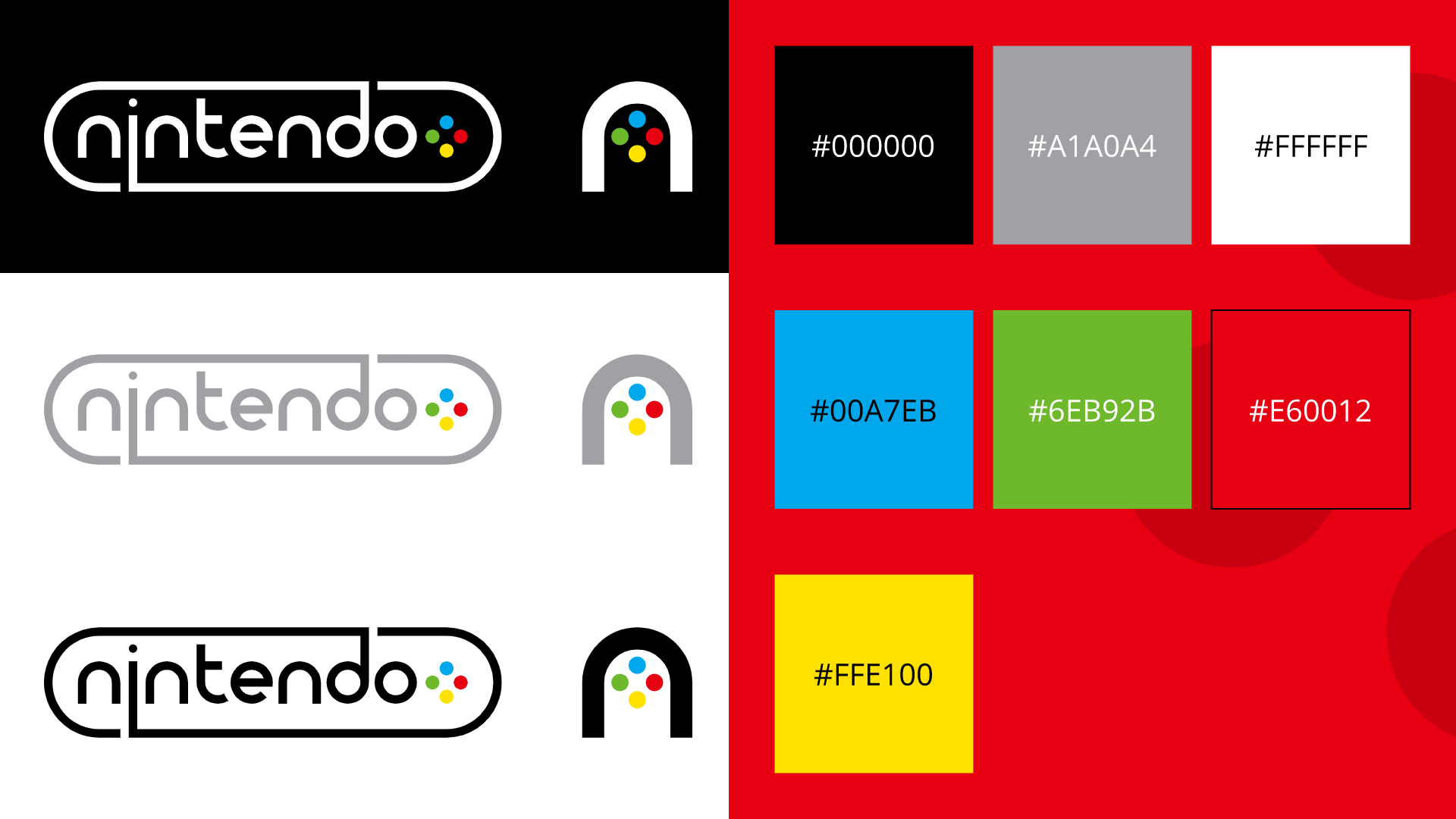


For this assignment, I was tasked with choosing a popular brand logo and coming up with a redesign for it. I chose Nintendo, whose logo, while iconic, is arguably a lot less visually interesting than the ones used by its main competitors (PlayStation and Xbox). I created a new logo that incorporated the A/B/X/Y buttons that Nintendo's controllers use in their classic configuration and coloring. I also created an Icon that worked on a smaller scale, which Nintendo currently does not have.